SELF-DRIVEN PROJECTS
KINEMATIC TYPOGRAPHY
As part of my thesis, I created "Kinematic Typography: Essence in Motion" where I focused on capturing the essence of a film through typography and its movement. Through a variety of transmedia and mixed media outside the computer, the typography is explored and supported by live action, animation, and other graphic elements, constructed in concert to convey the essence of the message. The followings are a few selected examples. Enjoy!
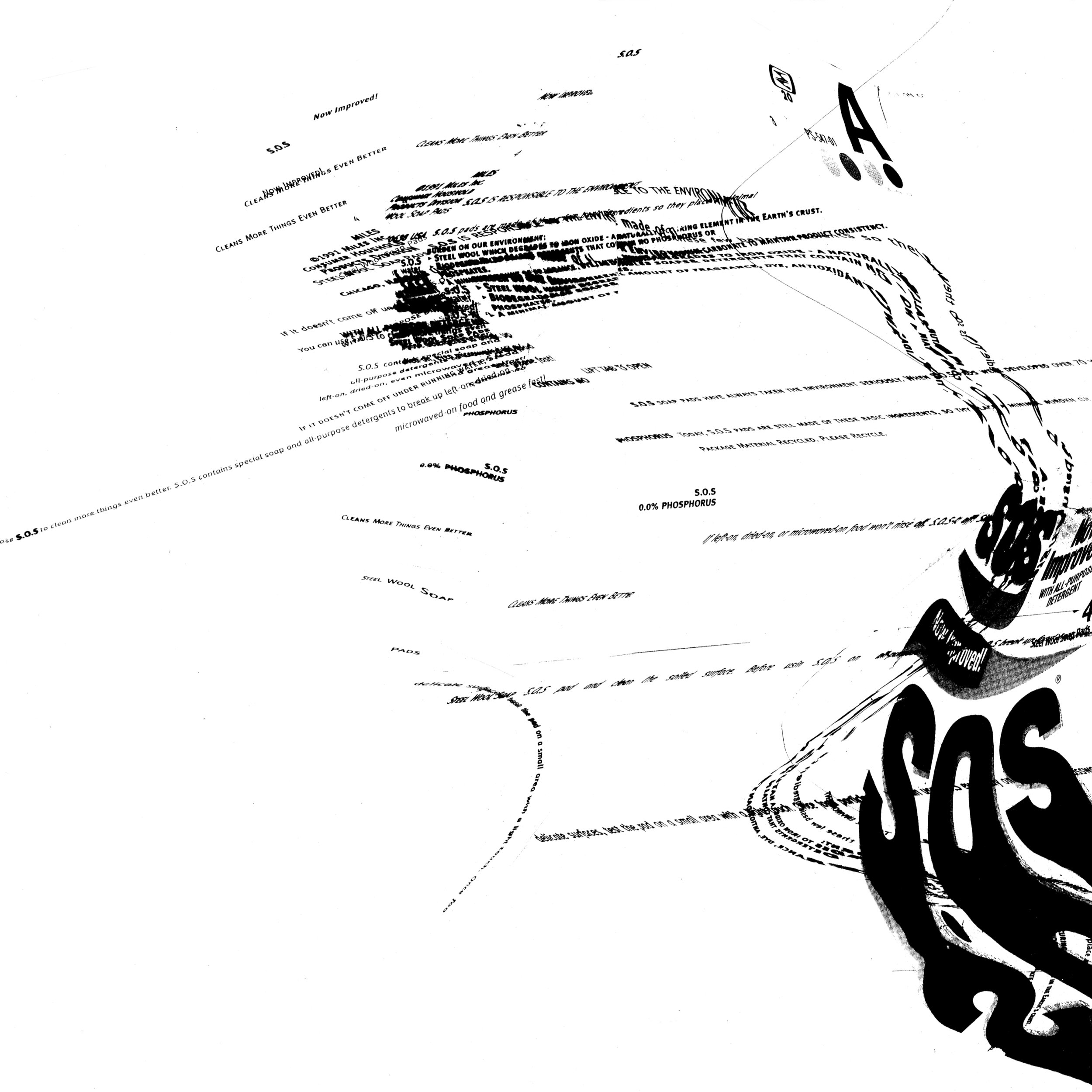
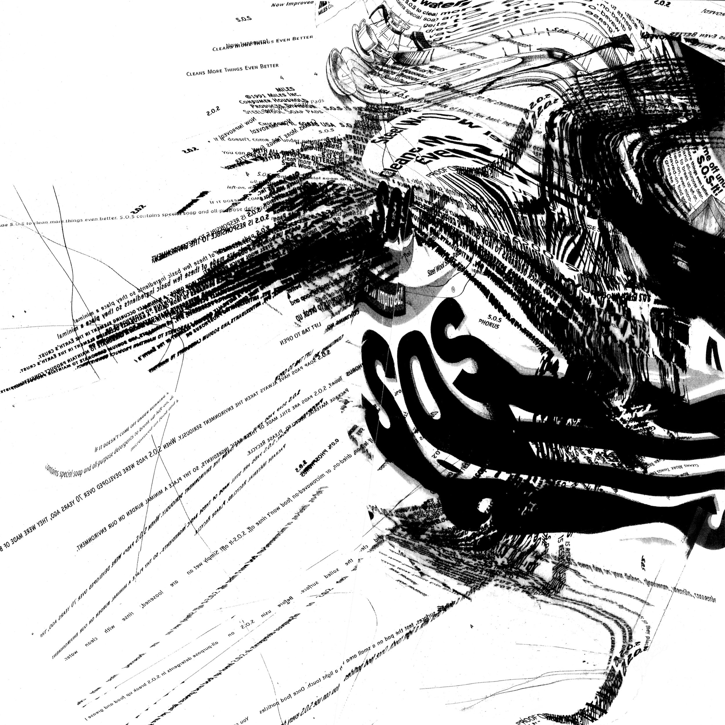
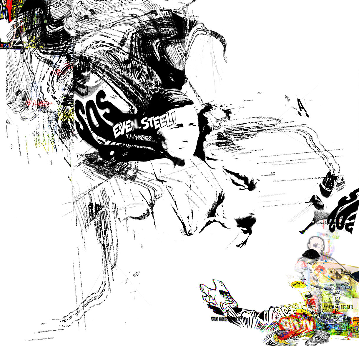
SOS
Just as the product SOS cleans and kills germs, it also saves lives. I used this analogy as a metaphor for the parent who is determined to fight for her newborn’s well-being in raising her family.
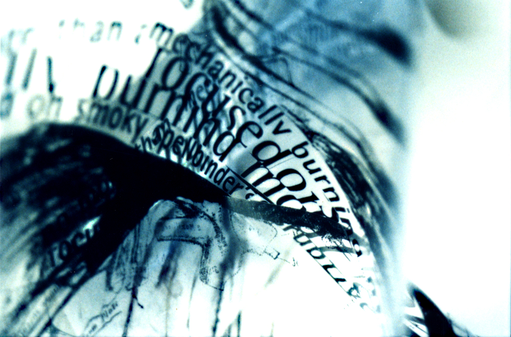
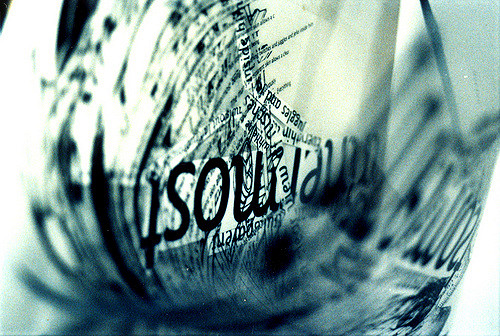
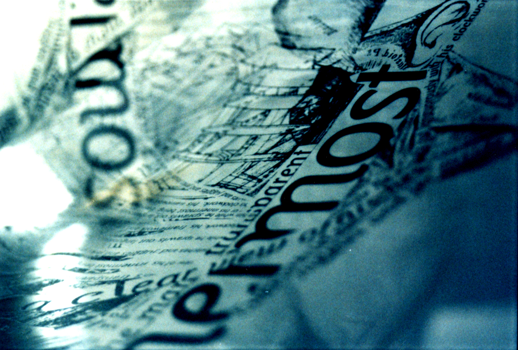
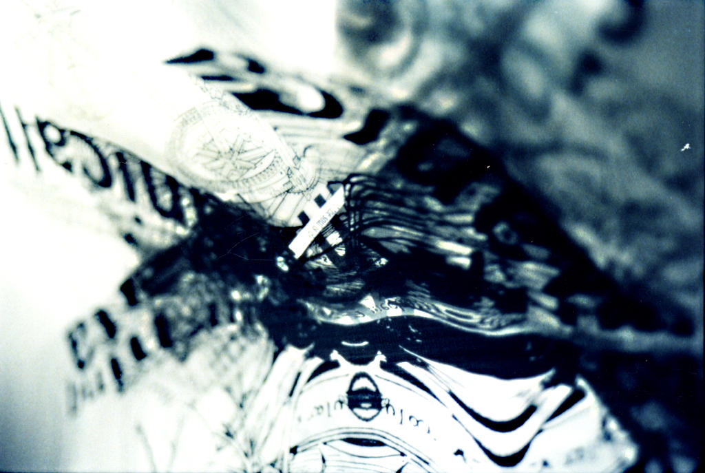
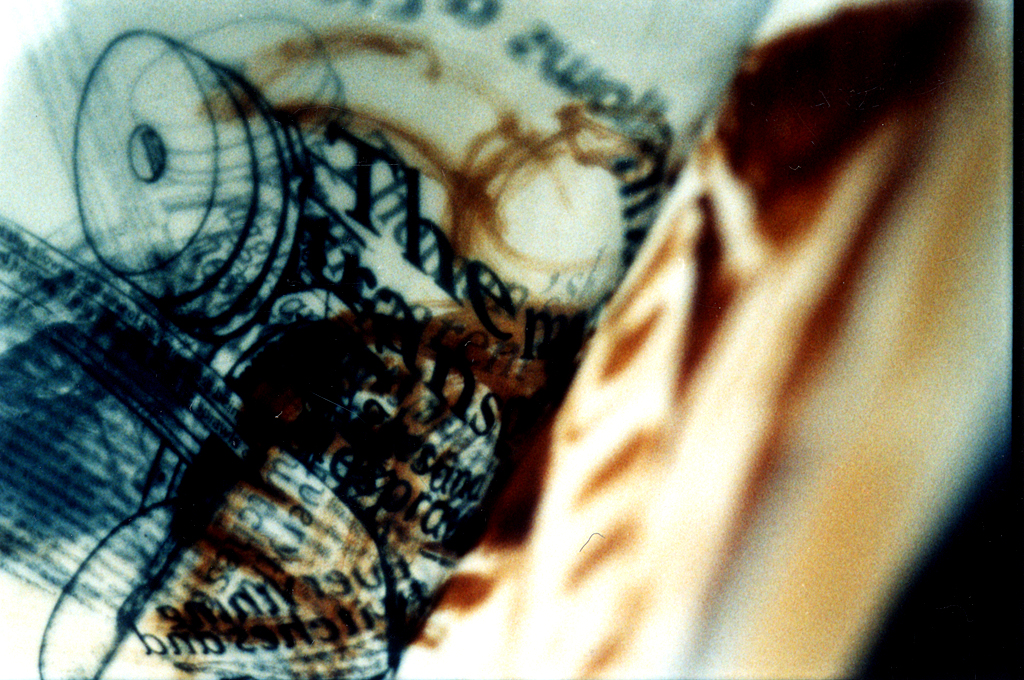
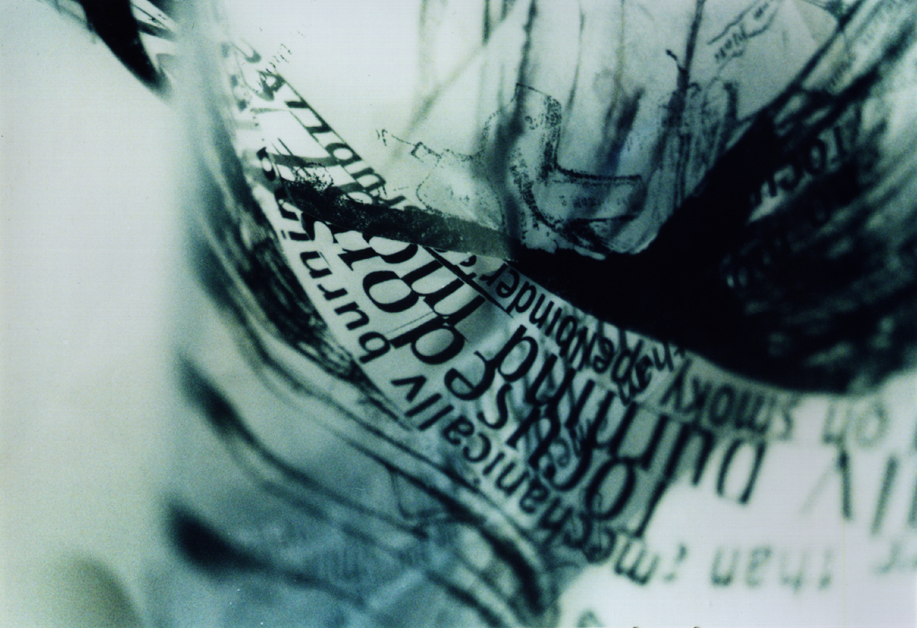
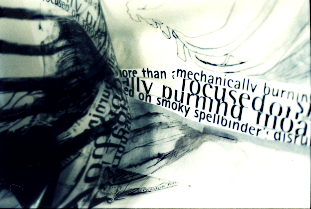
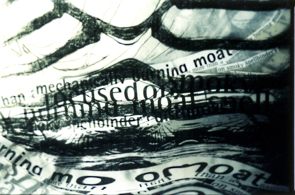
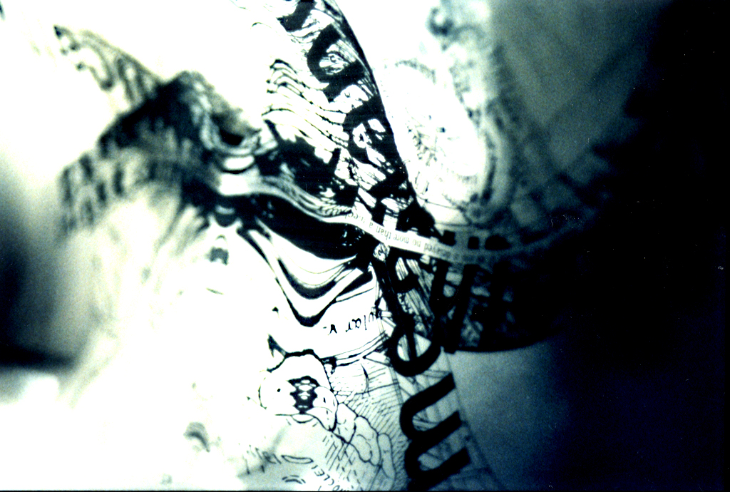
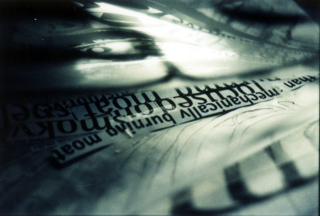
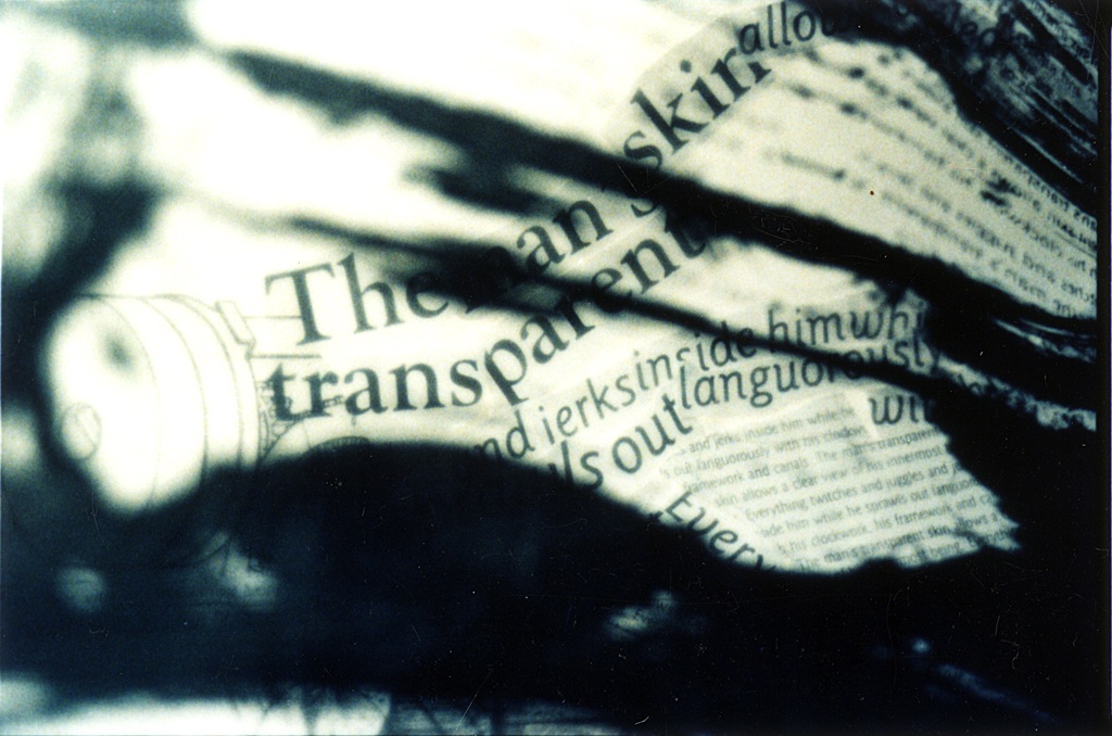
Poetry in Motion
Investigating a flat piece of print design into series of frozen frames in motion


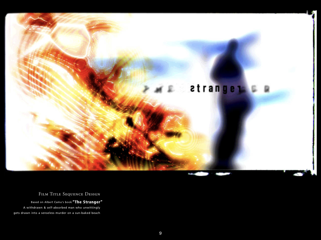
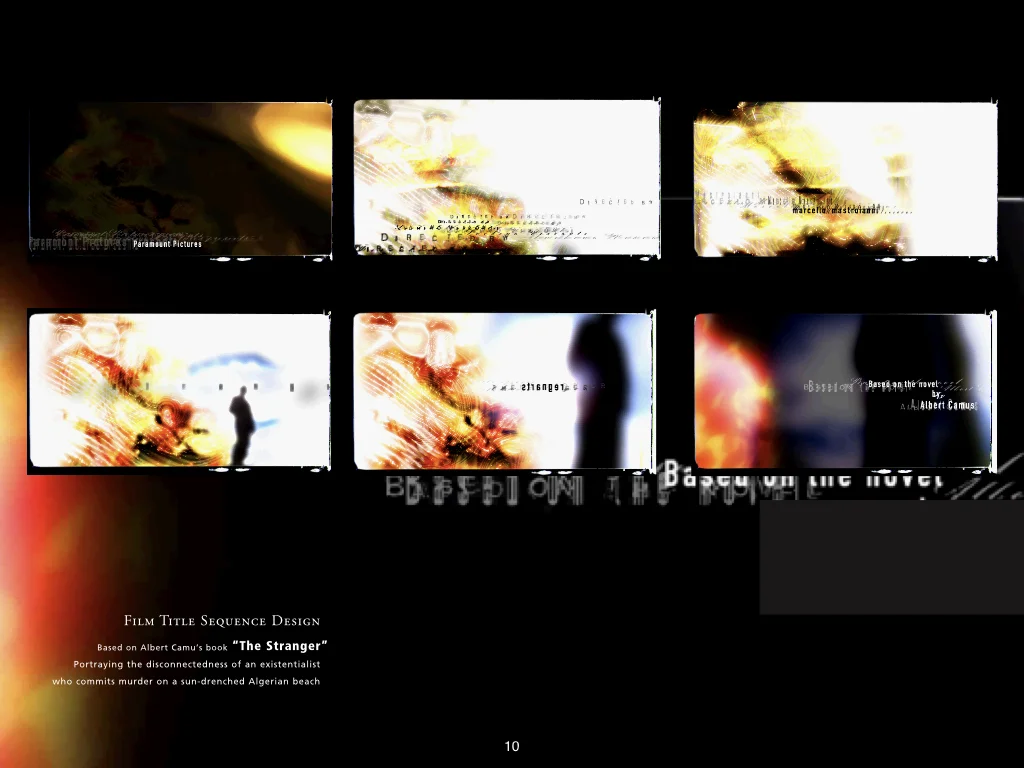
Film Title Sequence Design
The Stranger
Based on Albert Camu’s book, the graphics portray the disconnectedness of an existentialist protagonist who commits a murder on a sun-drenched Algerian beach.
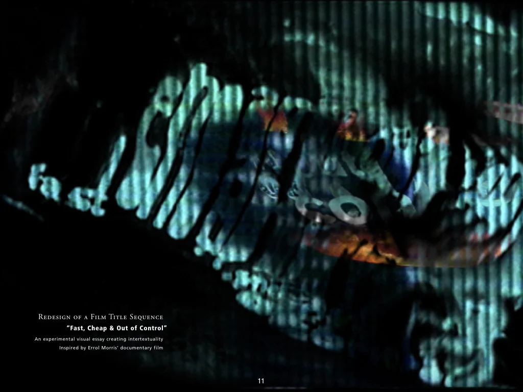
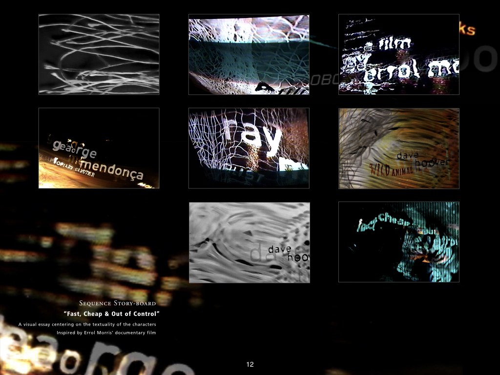
Film Title Sequence Design
Fast, Cheap & Out Of Control
An experimental visual essay centering on the intertextuality of the characters, inspired by the documentary film by Errol Morris.
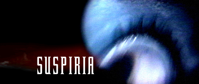
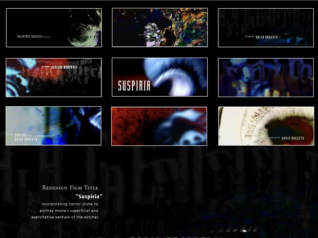
Film Title Sequence Design redesign
SUSPERIA
For a fiction film by Dario Argento. The graphics portray the movie’s exploitative venture, pervasive corruption, and the vileness of two witches’ coven.